In the midst of updating and maintaining your Facebook Pages, you may have come across all kinds of conflicting recommendations online about the optimum dimensions for your posts.
Here are some compilations of the sizes that are being touted by different websites that you can find with a simple Google search:
- 1,200 x 628
- 1,200 x 900
- 1,200 x 630
- 1,024 x 512
The list is not exhaustive as you will find even more resolutions if you start digging deeper. Bottom line, it is really confusing especially when you start looking at the aspect ratio and ‘cropped’ area that happens on different devices.
Additionally, Facebook keeps evolving and changing, so you can imagine how much of a nightmare this can be for most page administrators!
One way to circumvent all the ‘madness’ and preserve your sanity is to look at a “square” solution or an aspect ratio of 1:1. Thanks to the proliferation of mobile devices, we have found that having a square image of at least
476 x 476 pixels works best. Anything less than that will see you having a blurry image as Facebook scales it up. Ideally, you should work on a
1,200 x 1,200 pixel sto have the best result, though Facebook does compress your image once you upload it. We found that
800 x 800 pixels or even
600 x 600 pixels are also acceptable, so you should look at your own workflow and experiment.
The other reason why a square image works best, is ‘screen real estate’, in other words, your image will take up more screen space on a mobile device and this makes a better impression on the user. Most users scroll through their newsfeeds quickly and if your image is too small, your user may not be able to spot it while scrolling. The other advantage of a square image is, there will not be any cropping of the sides or top and bottom as opposed to rectangular images that don’t fit into Facebook’s set sizes.
You can see some examples listed below:
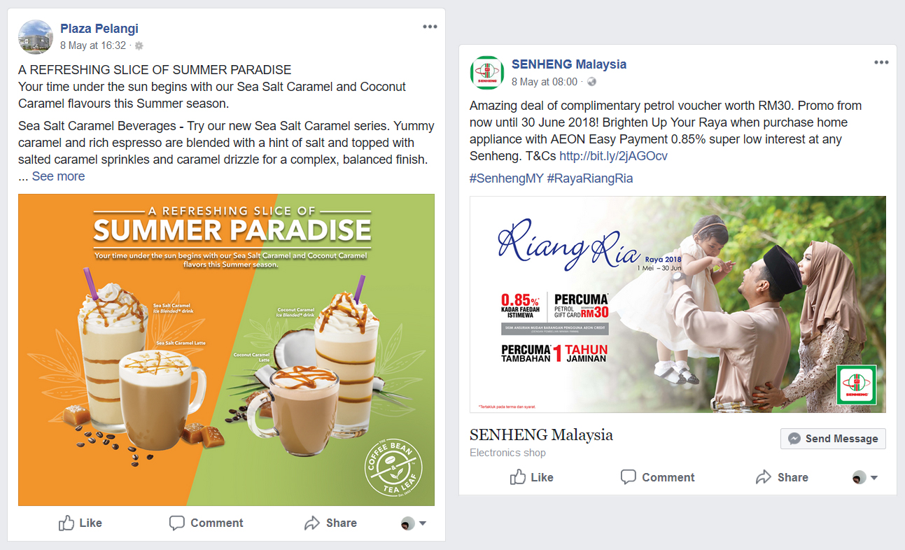 The example above has posts with the rectangle aspect ratio. Both are using different resolutions, hence the height difference.
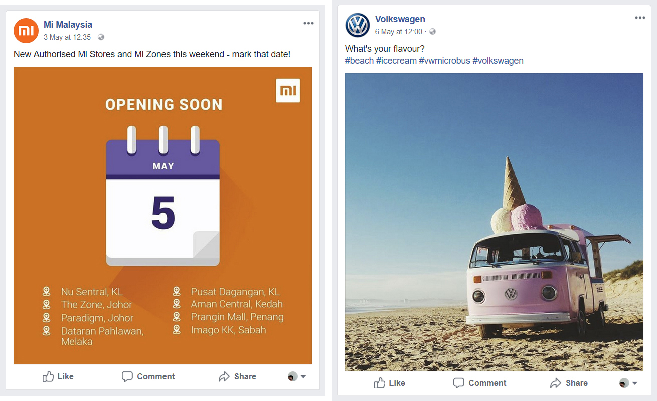 The example above has posts with square images. The images are of the same height and take up much more screen space on a mobile device, giving it better visibility!
So, the next time you plan to post any images on Facebook, remember that
it’s hip to be square!
Disclaimer – be aware that Facebook may change their policy at any time, so be sure to constantly check back here if there are any new updates.